
Tips for rethinking website design: now might be the time
If revamping your website means a 25% uptick in conversions, then now might be the time to do it. Ritesh Gupta investigates
Conversions may be up and orders rolling in but this is not the time to be complacent about website performance. That extra bit of speed, improved usability, stronger content or personalised recommendations can boost sales even further.
Recognising this, online travel business Cleartrip and car hire company Europcar recently decided to start with a fresh web canvas.
For Europcar, it was about simplifying the trip experience. “Customers look for ‘when, where and how much’”, says Marcus Bernhardt, chief commercial officer of Europcar Group. Meanwhile Cleartrip, according to Subramanya Sharma, chief marketing officer, the goals were to help users choose the perfect hotel faster and with greater confidence.
With a 25% uptick in overall conversions, Cleartrip’s decision has paid off. “Of course, this is an iterative process, but so far we are happy with progress,” says Sharma.
Here are five learnings from the experience:
1. Keep it simple
Enhancing search is what many organisations today are hoping to achieve and Cleartrip and Europcar were no exception. When working on the relaunch of its website last year, Europcar Group, for example, focused on a simple search experience on the home page. The aim was to complete the booking in three simple steps. It did this by:
· Developing a single search field for a quick first action on the site
· Improving the search section by enabling users to search rental destinations more intuitively
· Making information about the cancellation policy readily available
Cleartrip.com too recognised that finalising a hotel booking can be complicated and time-consuming given the large number of options to choose from. To simplify processes it had to evaluate several variables like hotel location, user ratings on TripAdvisor, available amenities, rate inclusions and so on.
2. The need for speed
For Cleartrip, a major consideration was to make the search experience ‘incredibly quick’. The aim was to present results instantly after one click on the ‘search hotels’ button. To achieve this, the main search architecture was revamped to release results two to three times faster.
3. Usability matters
On the usability front, Cleartrip introduced several contextual tools to help users efficiently shortlist relevant hotel options. Such tools narrow the result set and preferences.
Some examples include:
· Smart Tabs like the ‘Deals’ tab – helps bargain-hunters by displaying and sorting hotel with discounted rates
· The ‘Best-sellers’ tab – highlights the most booked hotels on Cleartrip for those looking for popular options
· Recommendations from travellers on what they love about a hotel
4. Driving conversions
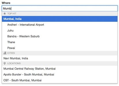
To ensure a site is relevant, developers must work on an number of variables including: price, location, amenities and so on. Location, for example, can be critical for business travellers who typically know they want to stay. “So we added the ability to search by area, landmark or even a specific hotel from right within the search form,” explains Sharma. In addition, the firm rebuilt the map view by adding the pan-and-zoom functions to simplify the process of exploring hotels, restaurants and other points of interest across the city.
A ‘Quick Look’ feature provides an overview of hotel amenities, rate inclusions and room rates at a glance. The same variables are also available as filters, so that users can shortlist preferred hotels with must-have amenities.
5. Tailoring your offering and thinking ahead
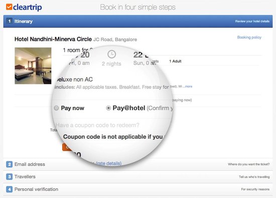
Driving bookings is paramount and addressing all segments while finding new approaches is essential. In India, because of the dearth of branded hotel chains, travellers “simply don’t know what the actual experience at the hotel will be,” says Sharma. And many still want to pay at the hotel. Reacting to customer needs, Cleartrip.com introduced the ‘Pay-at-Hotel’ option and participating hotels on the site are identified with this tagline.
Sharma stresses, however, that it hasn’t ditched the prepaid model. “For hotels that support the delayed payment feature, we offer users the option to either pay the entire booking amount online, or pay the same amount directly at the hotel,” he explains.
“The issue here is not about payment drop-offs or introducing this as a payment option. Many consumers are simply more comfortable with paying after seeing the hotel, and this appeals to that target segment,” he says.
After all, even before the rise of online travel, paying at the hotel was natural consumer behaviour. With the arrival of verified photographs and user generated reviews, however, consumers have become more comfortable with purchashing online. But some people would still rather pay when they see the hotel – and this is something that Cleartrip is adding to its armour.