
Three devices, three screens: why one site cannot fit all
How do you address the three-screen challenge? And is a desktop site adapted to fit all other screens really enough? ? Not for head HeBSdigital’s Max Starkov, who ahead of his presentation at the upcoming Travel Distribution Summit in London, shares some insights
The explosion of mobile and social media channels and the emergence of the new tablet channel present a major challenge to hotel marketers: Creating and managing digital content across three distinct distribution and marketing channels (desktop, mobile, tablet) while publishing the hotel’s latest special offers and promotions on the hotel’s social media profiles.
Over the past few years, industry experts have projected staggering growth rates in leisure and unmanaged business travel bookings via the mobile channel: from $753 million in 2011 to $2,155 million in 2013 according to PhoCusWright. Accordingly they have advised hoteliers repeatedly to embrace the mobile channel.
And yet, a careful analysis of industry statistics and projections reveals a very interesting picture that not all hoteliers fully understand: The majority of ‘mobile’ bookings, room nights and revenue are generated by tablet devices such as the iPad, Samsung Galaxy and Google Nexus, not by ‘pure’ mobile devices like the iPhone and Android- and Windows Mobile-based smartphones.
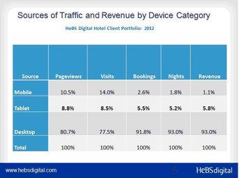
Across HeBS Digital’s hotel client portfolio, tablets generate 200% more room nights and 430% more revenue than ‘pure’ mobile devices.
In my view, desktop, mobile (smartphones) and tablet devices and their respective marketing and distribution channels should be treated as separate device categories. Tablets are portable yet stationary devices, predominantly used indoors with a high-speed Internet connection: at home or work, at a coffee shop or in-flight. Web analytics from major hotel brands, OTAs and HeBS Digital’s portfolio show that 85% to 90% of tablet browsing happens via a WiFi connection, while mobile devices use telecommunication carriers such as AT&T or Verizon to access the web.
Mobile users and tablet users require different content. The always-on-the-go mobile user requires short, straight to the point information: hotel location, maps and directions, summary of the hotel product, easy to use mobile booking engine, and a click-to-talk property reservation number. Hence the need for a mobile-enabled website with specialised content.
Tablet users require deep, visually enhanced content about the property, its product and destination. This is why all hoteliers serve their desktop website content on tablet devices today. Unfortunately, the desktop website cannot accommodate the touch-screen navigation required by tablet devices along with the high-res photography and highly visual presentation necessary to display the hotel product.
Online travel consumers have all become multi-device users and have different needs at different times of the day and week that are catered to by different devices: desktop, mobile device or tablet.
According to Google, users searching Google utilise:
• Desktop during the day (office)
• Mobile during lunch break + happy hour
• Tablet later in the evening when lounging, ie: the tablet is a ‘lounging’ device
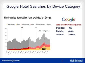
According to Google’s data, 7% of all searches now come from tablets, vs. 14% from mobile devices and 79% via desktops (2012). Google projects hotel queries from tablets will increase this year by more than 180%, while queries from mobile devices will jump by 68% and desktop searches will decline by 4%.
Responsive Web Design (RWD) – one site fits all?
In the multi-channel, multi-device world in which we live, hoteliers are overwhelmed by the variety of marketing and distribution channels and devices on which they need to establish and maintain a marketing presence. It is difficult for many properties to keep their ‘old fashioned’ desktop website up-to-date, let alone the three different versions of the property website necessary today to accommodate the unique usability and content requirements in each of the three distinct device categories: desktop, mobile (smartphone) and tablet.
Lately, some web development vendors with no experience in hospitality have been promoting Responsive Web Design (RWD) as the recommended approach to provide optimal viewing experiences across a wide range of devices, from desktop to smartphones. Here comes the question: Should hoteliers be receptive to this ‘one site fits all’ solution?
In our view, for content-rich and revenue-focused websites such as the hotel website, fitting the desktop website into different screen sizes, achieved via traditional RWD, is not good enough. Just imagine using simple responsive design to attempt to fit Marriott’s desktop website (Marriott.com) and all of its 22,700,000 pages and files indexed by Google onto the iPhone 5’s 640x1136 screen. Or fitting all of NewYorkPalace.com’s 22,200 pages into a Samsung Galaxy S’ 480x600 screen. Obviously, this is an unmanageable task.
In addition, the adoption rate of smartphones in the UK is 51% (44% in the US). The other half of the population is still using feature phones, which are not sophisticated enough to display full desktop websites. The vast majority of people of age 65+ do not use smartphones today, and these are exactly the baby boomers you would want as your property guests.
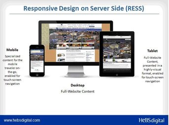
HeBS Digital’s opinion is that at this time, hotels should serve the correct website content for each device category (desktop, mobile, tablet) while ensuring the optimal user experience, relevancy of information and conversions. This is achieved via RESS (Responsive Design on Server Side), the next generation of RWD. This is why here at HeBS Digital, we do not use simple RWD capability for content-rich, revenue-driven hotel websites. We recommend the use of RESS instead, which provides not only the optimum viewing experience, but also the correct content and the maximum user experience in each device category. Correct content and the maximum user experience in each device category.
HeBSdigital’s Max Starkov will speaking in the ‘Capitalize on the Rise of the Tablet’ session at EyeForTravel’s Travel Distribution Summit Europe 2013 (May 23-24) in London.
What Does Google Say on the Subject?
Google recommends either RWD - responsive web design (front-end CSS manipulation of the screen size) or RESS - responsive design on the server side, which is what we practice here at HeBS Digital.
There are three options:
1. Responsive Web Design (RWD) that serves the same HTML to all devices and simply changes how the page is rendered on the device.
2. Responsive Design on the Server Side (RESS) that serves different HTML depending on whether the user is on a desktop, mobile or tablet device.
3. Sites that have separate mobile and desktop URLs, which Google recommends against.
Google does not have a preference between RWD or RESS. The main issue is what kind of information (read number of pages) on-the-go travellers need? Do they need all the information provided on the full desktop site? The mobile traveller requires short, slimmed-down content with an emphasis on property location, area maps and directions, real-time “smart rates” and availability, an easy-to-use mobile booking engine, and a click-to-call property reservation number. Due to usability and security issues, six of every ten mobile bookings actually happen via the voice channel.
Recommendations
Begin by treating the desktop, mobile and tablet as three separate channels. Internet users exhibit different behavioral patterns when browsing the Internet and the desktop website, mobile and tablet devices, as they address different needs at different times of the day and week. It is obvious why specialized content is needed for each device:
· Desktop users need as much information as possible, including a minimum of 25-50 content pages per property and another 50-100 specialized marketing and landing pages featuring special packages, promotions, and events. Desktop users also place high value on visual galleries with photos and videos.
· Mobile (smartphone) users require a 10-15 page mobile-enabled website with slimmed-down content with an emphasis on maps and directions, an easy to use mobile booking engine, and a click-to-call property reservation number.
· Tablet users require deep, visually enhanced content about the property and its destination. A well-structured, highly visual hotel tablet-optimized website can generate conversion rates several times higher than those of mobile devices.
All three device web presences could operate within the framework of Responsive Design on Server Side (RESS) and be managed via a single dashboard in the property content management system. For example, HeBS Digital’s CMS Premium is a fully RESS enabled content management system.
Second, hoteliers need to upgrade their property website technology to the next generation of Content Management System (CMS) to enable:
· Management of desktop, mobile and tablet website content (copy, photos, special offers, events and happenings) via a centralized dashboard.
· Responsive Design on the Server Side (RESS), which employs device-specific modifications to CSS and Java Script to present a customized desktop, mobile and tablet “front end” of the website, while utilizing the content from the central CMS on the back end.
· Use analytics tools such as Adobe Omniture SiteCatalyst to determine contributions from and the dynamics of each of the three channels.
Third, all three channels must be integrated within the hotel’s multi-channel marketing strategy. Use analytics such as Adobe Omniture SiteCatalyst and Google Analytics to determine contributions from and the dynamics of each of the three channels.
Fourth, all three device channels must be integrated in the hotel’s multi-channel marketing strategy.
Note: Max Starkov’s presentation for the “Capitalize on the Rise & Rise of the Tablet” session during EyeForTravel’s Travel Distribution Summit Europe 2013 will be held at 4:45pm on May 24, 2013 at Novotel London West Hotel, London. For more information and how to register please visit http://events.eyefortravel.com/travel-distribution-summit-europe/index.php
About the Author and HeBS Digital
Max Starkov is President & CEO of HeBS Digital, the hospitality industry’s leading full-service digital marketing and direct online channel strategy firm based in New York City(www.HeBSdigital.com).
HeBS Digital has pioneered many of the best practices in hotel Internet marketing, social and mobile marketing, and direct online channel distribution. The firm has won over 250 prestigious industry awards for its digital marketing and website design services, including numerous Adrian Awards, Davey Awards, W3 Awards, WebAwards, Magellan Awards, Summit International Awards, Interactive Media Awards, IAC Awards, etc.
A diverse client portfolio of top-tier major hotel brands, luxury and boutique hotel brands, resorts and casinos, hotel management companies, franchisees and independents, and CVBs are benefiting from HeBS Digital’s direct online channel strategy and digital marketing expertise. Contact HeBS Digital’s consultants at (212) 752-8186 or success@hebsdigital.com.