
March 2014, San Francisco
3 noteworthy visual marketing trends from a luxury travel brand
Feeling blue about your social efforts? Should China make you see red? Does colour really impact your marketing efforts? Pamela Whitby finds out
After a long, grey and soggy winter in the UK, many of us are already dreaming of endless clear blue skies and vast expanses of ocean. Since research shows that 60-90% of a person’s judgment about a person, environment or product happens with 90 seconds is based on colour alone, perhaps blue marketing messages will be the one’s we Brits respond to most this year.
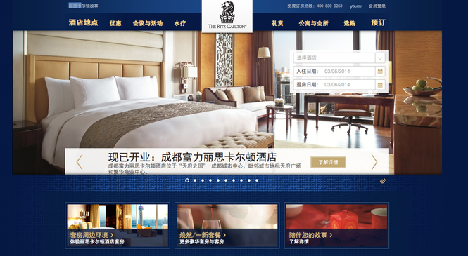
Colour has certainly proved very important to the visual marketing efforts of Ritz Carlton, a growing luxury brand with a strong visual presence across ten social media channels, including two in China. It has recently launched full feature Mandarin Chinese website to promote the ten hotels it has in the country.
According to Allison Sitch Ritz Carlton’s Vice President of Global Public Relations, who will be speaking at this month’s Social Media and Mobile in Travel event in San Francisco, everything they do is driven by research. Here she shares three findings that impacted the brand’s visual marketing efforts.
1. All arrows point to the colour blue
When it comes to visuals, across the board the colour blue comes out tops in Ritz Carlton’s research. “Every time we use photos that have a prominent colour blue in them, or tones of blue, we get far more engagement across all our channels,” says Sitch. Ritz Carlton has a presence on ten social channels and has been in the social space since 2009. From YouTube to Instagram, Facebook, Tumblr and YouKu, it tracks and measures engagement across every single channel to see what performs better. “Time and time again, all arrows point to the colour blue,” she says. While images with dominant red and orange tones may look warm and inviting, for Ritz Carlton they just don’t drive the same engagement. “That's absolutely changed the way we do photography,” says Sitch.
2. China shouldn’t make you see red
As one of the first international brand’s to launch a full feature Mandarin Chinese website, Ritz Carlton was keen to get it right. The Chinese do not have a huge awareness of this brand, and even find it difficult to pronounce the name phonetically, explains Sitch. With ten hotels in China and more in the pipeline, this is “a really important market for us”.
Of course, red is strongly associated with China. So it is not surprising that initially everyone Ritz Carlton talked to said this colour should dominate its digital presence. “But when we test this in front of Chinese consumers they said: ‘stop thrusting the colour red at us’”. What Sitch learnt from this is that when using colour, you need to understand how it works for your own brand. Hence the dominant colour on the Ritz Carlton website is, well, predominantly blue.
3. Know your colour, know your customer
Remember though that Ritz Carlton is a high-end luxury travel brand and so perhaps it’s not surprising that its customers (half a million Facebook followers are customers) respond to the colour blue, with its connotations of dignity and intelligence.
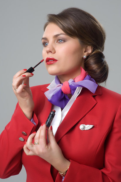
In fact, red - and very often a combination of blue and red (think American Airlines, BA, China Airlines) - is another popular choice that signifies action, adventure and power. This is the colour of Japan AirLines (JAL) with its logo of a red bird taking flight. In Asia, red is also a sign of good luck. Probably one of the most recognisable ‘reds’ in travel is Virgin Atlantic. The colour is so marketable, that the airline has even launched a lipstick for its cabin crew to wear in the same shade.
Blue and red are, needless to say, not the only choice for successful travel brands. TripAdvisor chose green, the colour of growth and rebirth. Meanwhile low-cost airline EasyJet, went for a cheery orange; perhaps because for marketers this is a colour that people associate with value and discounts.
So does colour really matter to visual marketers in the travel space? Absolutely! For Ritz Carlton, there can be no doubt that blue works in images but the use of blue in China was about understanding their customer and sticking with a colour that was true to the brand.
Take a look at the infographic below to see what colour means in the marketing space. Oh, and don’t forget to join us in San Francisco later this month where we will be hearing much more about trends in visual marketing
